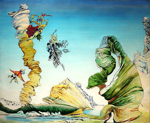
Jackson Pollock, born in Cody, Wyoming in 1912, was one of the most revolutionary artists of American culture. He was mostly well known for his loose and obscured methods of painting abstracted art. He started his paint throwing techniques at a workshop in New York City and soon moved to Springs Long Island, Ny where he perfected his creative and expressive style of painting. Pollock started to use resin-based paints because they had a more liquid quality and were easier to throw on canvas. His techniques of splattering, dripping, and pouring paint with different instruments including sticks and hardened brushes were crucial to how his paintings developed. For example in Pollock's "Male and Female" right above he used a lot of his newly developed paint pouring and other techniques to create this extremely expressive and textured piece of work. His new style of "action painting" broke through the barriers of western art. It created a whole new way of viewing and critiquing paintings. People saw the movement and expression of the strokes and splatters placed upon the painting rather than trying to analyze the subject matter of it. Pollock actually started to number his paintings and stopped giving his paintings names just for this reason. He wanted people to see the painting for the painting and not try to search for representations in his works. Pollock's style of painting included movement of his whole body and not just his hands. By working on the ground he could move easily around the canvas and have some control over where the paint ended up. He would virtually dance around his canvas and throw paint around while still knowing where and how he wanted the paint to fall. Jackson Pollock's abstract pieces are a staple in American art and influenced a whole new wave of painting. His free and loose style has and will continue to inspire abstract painters for years to come.
Jenny Saville was born in Cambridge, England in 1970. In 1988 she attended the Glasgow School of Art located in Scotland. It was there where she earned a Bachelor of Arts degree in Honors Fine Arts. Her frustrations as an art student inspired her greatly. She was bothered that she only had male art instructors and wanted to focus her art on women. In particular, women’s body image. When she was still an undergrad she was awarded a scholarship to attend the Cincinnati University. She worked there for six months. While she was at school in Ohio she found herself inspired by the Midwestern Americans shopping in the various malls. She stated there were, “lots of big women. Big white flesh in shorts and t-shirts. It was good to see because they had the physicality that I was interested in”. Inspired by the various body images, Saville created her college degree show. It was at this show where prominent gallery owner, Charles Saatchi, bought her entire show and commissioned her starting her career as an artist in the 21st century. She then moved to New York where she worked closely with a plastic surgeon documenting the various surgeries that she would create countless paintings on. She now resides and works in Italy. Saville’s painting “Branded” was completed in 1992. It is a rather large oil painting on canvas with dimensions stretching 7’x6’. It is the first prominent picture in Saville’s book and I find myself particularly drawn to this painting because it vividly describes the artist’s subject matter and focus. The painting is of an over weight woman standing with one hand at her side and the other grasping her stomach fat while she looks down at the viewer, which is almost intimidating. Saville’s paint application in “Branded” as well as her many other paintings is extraordinary. She adds oil paint as if she sculpts her figures through brushstroke. She stated that she can mix up to 300 colors for a painting and prefers using pots of paint to mix in rather than a palette. She has been compared to artists like Lucien Freud. “Branded” forces the viewer to think about the ideas of femininity and what’s considered beautiful. Saville does this by creating such a large image and the puts words on the models body. The words read, “support”, “decorative”, “delicate”, and “petite”.
Saville also brings up the idea of the modern day cannon in her work. She comments on the cosmetic industry and worked closely with a plastic surgeon where she took her own photographs to create countless images which she then turned into paintings. In The painting “Plan” created in 1993, she forces the viewer to think about the body becoming a topographical map ready to be altered in the planes that are too wide. This painting is 9’x7’ and also looks down at the viewer, returning the gaze.
“Knead”, 1994, is a slightly smaller painting reaching 5’x 6’. It is a disturbing image of a woman in what appears to be in surgery. The woman has her eye taped and a tube down her throat. There is discoloration to the image that makes the woman appear to have bruising and scars from what looks to be a face-lift. Saville’s images are striking and really make strong statements about plastic surgery. I find it really interesting that something so disturbing and disgusting can also be so beautiful.
As Saville’s work progressed she started to create paintings about the transgendered. In 1999 she produced “Matrix” which is 7’x10’ and oil on canvas. In this painting she has a man that went through surgery to become a woman. The painting focuses on the constructed vagina and bosom while the man’s face looks past the viewer. The painting is really delicate, and for me, thought provoking on what it means to identify with a certain sex. In an interview she states that, “When I was painting the genital area, I was trying to think about ways to use intense color and make marks that heightened a feeling of sex. Then when I painted the thigh, I had this area at the topside of the thigh and had four or five tones mixed up that I knew I wanted to run into each other. I got them all really oily. It was a one shot, to keep the color clean but slide them together and create the thrusting dynamic of this leg lifting up. The white dripped right across the thigh towards the genitals. It was this incredible, orgasmic”. In 2004, Saville completed “Entry” ranging around 7’x6’. This painting is a portrait of an older woman who has been deformed by something. She looks down past the viewer with a sad longing look in her eyes. The colors used are cold and sickening evoking a depressing feel. I chose this painting because it speaks to Saville’s more recent work discussing deformities and once again confronting the viewer of what is considered to be acceptable by society. (Sorry, I couldn't get the last image to load. I will try again later).
Anselm Kiefer, born on March 8, 1945, is one of the most significant German artists.Growing up during the end of World War II, Kiefer dealt with very controversial subject matters in his paintings and sculptures.Kiefer went to Albert-Ludwigs-Universitat with intentions of studying law.The direction of his studies quickly changed to art in 1966, studying under Peter Dreher.A few years later, he studied under Horst Antes at the Staatliche Akademie der Bildenden Kunste, and then studied under Joseph Beuys.Beuys had a large influence on Kiefer and the themes he worked with, such as cultural myths and symbols.In the early 1970s, shortly after getting married and moving to a secluded village in the Oden Forest, Kiefer began working with mythical and historical German figures in large format.More recently, Kiefer has branched out from German themes, incorporating ancient Hebrew and Egyptian history, theology, and mysticism.The theme constant throughout his career is the trauma societies go through, and their continuous rebirth.
Kiefer was greatly influenced by German history, especially the destruction and horror of the Holocaust.Through his paintings, Kiefer is holding a mirror up to the catastrophe and devastation Germany was left with after the war, graphically retelling a story that was – and still is – hurtful and disturbing to many.Ann Hanson observed, “there’s tragedy in every brushstroke.”Kiefer’s belief was that art is a means by which you can have a dialogue with history, so he powerfully represents ideas and emotions that will touch each viewer.Historically significant names, events, and places are often scrawled across his paintings.He juxtaposes contrasting ideas Kiefer’s works utilize materials such as straw, glass, wood, plant parts, clay, and lead.The paint used is usually in earthy or dark, somber colors, giving his paintings a depressing, tragic feel.
James Rosenquist known most frequently with the Pop Art Movement started out with little schooling but rather chose to focus on working within the industry. Rosenquist became a member of the Sign, Pictorial and Display Union, Local 230 from 1957-59. He was employed by A.H. Villepigue, Inc., General Outdoor Advertising, Brooklyn, New York, and Artkraft Strauss Sign Corporation. While working for A.H. Villepigue, Inc he painted billboards in the Times Square area and other locations in New York. This type of work led him to utilize images that are already available to put into works.
Rosenquists involvement in the Pop Art movement was based off of this idea of using these images. Other artists such as Roy Liechtenstein, Andy Warhol, and Peter Max where also involved in Pop Art during the 50’s and 60’s. Rosenquist specifically worked with images that were primarily recognizable but didn’t necessarily place them with relational object. His paintings throughout his work in the past five decades have remained to be colorful with great imagery. The images in his work or often layered and even separated from the base of the works. To begin most of his paintings he started with collages, which can be seen through the final pieces.
Rosenquist worked primarily on large canvases or even on Masonite. His working on large canvases stemed from his early experiences of working with billboards. Rosenquist utilizedmass-produced goods, magazines, films and other aspects of the mass media, together with his dispassionate and seemingly anonymous technique to create these works that are considered key figures in the development of Pop Art.
President Elect.
Oil on Masonite, 84 x 144” 1960-1961
In the Red Oil on Canvas, 66 1/4 X78 1/4”
1962
Portrait of the Scull Family Oil on Canvas with two attached panels, 76 3/4 x 96” 1962
After the critique, I wasn't too surprised by what I heard about the spaceship thought since I actually came in that day being like, oops, that looks a little like a spaceship type thing. Oh well. As for the other responses, I enjoyed hearing what other people had to say about the piece. I am, in fact, not altogether pleased with the final product but I did like hearing what the class had to say. Thanks guys!
I started out on this painting having no idea of what I wanted to paint, which tends to be a problem when it comes to starting my work in general so this was nothing new. Then something happened to me over one weekend and it made such an impact on me. I realized I wanted to somehow portray the feeling of disappointment and regret. I struggled to what images came to mind when I thought of the emotion. So in order to just get at least something on the canvas, I just painted whatever I felt. The first version, with the drips of thick blue paint and light blue/green paint in between, I liked a lot. I didn't think the blue really went with the feeling I was going for so I painted over the whole thing with a darker, grayer blue.
When I thought about this feeling, I kept thinking about the sense of having everything fall down around me. And that there would somehow be a sense of loneliness in the fact of being such a disappointment and having such regret. So I kept painting over what I would have previously done about an hour before, disliking everything that was coming out. Then I tried to use a different technique, the spray painting. I painted what I felt in my head. I guess it came out looking a bit like a space ship beaming down but it was more supposed to look like the effect of a whirlwind. Having those feelings of regret and disappointment came to make me feel like I wasn't really sure how to act anymore and left me feeling confused. It was centered because I felt like, after this event, that every time someone looked at me, they knew exactly what had happened and were judging me for it, which of course now, looking back on it, I know is not the case. The strokes on the outside are supposed to have the effect of everything falling down. Although it doesn't come off like that, I like the looking they give to the painting.
Entry 1: My original proposal is an interpretation of Cleveland architecture (my geographic home). I feel that for an Ohio school, the students at Denison whom I have interacted with never seem to know much about the larger cities of Ohio. Frustratingly, fewer people still gave them any credit whatsoever for their local cultures, largely as a result of their incidental ignorance about these cities. My idea is to use the strong lines and interesting shapes from various contemporary buildings around Cleveland. One iconic building in Cleveland is the Rock and Roll Hall of Fame, located in the heart of Cleveland. Award winning architect I. M. Pei designed this structural gem that bears a similar pyramidal shape to the Louvre’s Pyramid, another of Pei’s designs. Another notable architect is Frank Gehry, who designed the business school building at Case Western Reserve University in Cleveland. What I came to realize is although these are very inspiring architects and interesting buildings, I can’t identify with them in the way that I felt necessary to complete the assignment. Instead, I found inspiration in absolute devastation.
Entry 2: The topic has changed. The night that I was stretching the canvas for this piece, my mother called with terrible news. Our close family friend who had been living in New Zealand with her children and husband for almost a decade killed herself two months ago. My godfather, her husband regretted to tell us and we only learned the news of her death through another mutual friend. This news sank into me with one of the bluest moods that I have ever experienced. I feel sometimes that my melancholic moods are unfounded and self-absorbed. I’ve written essays in high school that elicited the, “Are you okay? Really though…should I be worried?” question from teachers. This was quite different, as all deaths are. I walked over the threshold next to the coffee maker in the studio and heard my mothers news but continued walking completely stunned until I reached the first tier of the corner of the studio where my easel was located, and burst into tears. Given my procrastinatory nature, leaving the studio was a non-option, for we needed our canvases stretched and primed by the next day. So I stretched and primed with tears running down my face. It was messy, but complete.
Entry 3: I took to the canvas without anything but Marily in my mind. I wanted the deep intense blue to signify melancholy to the viewer, although its brightness seems cheerier to most. The yellow represented life, that was being suppressed by the blue cubes. The dripping was a sort of cleansing of the canvas, a washing away of all of the anxiety and pain. I was thinking of her daughter, who is about fourteen and how she will experience adolescence without a mother, knowing that she willingly… I don’t even know how to express this. While the whole canvas was wet, a single drip from the top of the canvas cleared a white drip that went through the muckier middle. Here I put the red, the third and final primary color, (the whole painting was ‘tube colors’ just like I like it). The red was intended to be blood, an open wound that will not heal with anything but time. The painting doesn’t convey all of this emotion, but I remember it as a specific moment in time, and am reminded of this tragedy each time I look at the painting. Although titles weren’t required, I would have named it something like, “the sky isn’t crying, I am.” Pretty literal, eh?
Post-Crit I was very happy with my peers interpretations of this first piece. Most interpreted the red as a wound, or as blood, and that was spot-on. The word ‘boring’ was thrown out about it, which was disappointing and indicative of its failure to convey the true emotion experienced while creating the piece. My absolute favorite interpretation was one that I hadn’t even considered myself. This is the idea that everything seems okay on the outside, but if you look a little closer, there is another darker, sadder, more macabre world that this peer of mine saw.
I was completely without ideas for the next abstract painting. That’s why I’m writing this late. I should have just written that after much debate I still hadn’t come up with an idea that relates to the class and with my senior research. It wasn’t until was listening the song “Yes We Can” and thinking about how this music could be really conducive to meditation. So, I just kept listening and trying to feel the music and I though to myself that this song is all about waiting for something special. That something special, in this song, is Barak Obama. I want to express that same sense of discovery. This is the same waiting and yearning for something that I’m trying to find through my drawing and paintings. And the same that I am studying though my senior research. For this particular painting I was the paint to be thick but smooth. Not hurried at all; very like meticulous. Good song. I wish I knew who composed it.
Final Write Up: This painting did not come out the way I wanted it to. And in the end I ended up covering most of the painting with thick grey-brown lines covering it. Over the weekend I realized that when I feel like a painting of mine has failed I effectively ruin or destroy it because what I have painted has not lived up to its idea. I started off trying to express a sense of waiting in anticipation. I used a progressive techno song to inspire me. I ended up trying to depict the song and no the sense of waiting. I was doing a much better job at reaching my goals in the beginning when I was first starting the painting but as I added more and more paint it became lost and I could see no hope of retrieving it. So I painted over it to give that viewer then sense of it being unattainable at the moment. Like they want to be able to see it but are unable to just as I was unable to see the idea anymore.
Going along with the theme from my previous larger painting, I’d like to continue to use music and the feelings it evokes as my motivation. I think that movement is a natural part of music. Physical action is involved in its production and its elicited response. What I love most about progressive techno, or trance, is the standard buildup as a key element. A lot of music uses this change in pace and volume in order to inspire a certain feeling, however in progressive techno not only is this its goal, but the feeling is most often one of elation or ecstasy. The music makes me happy, it gets my adrenaline pumping and it’s these emotions that make me want to hear more. The music plays on this anticipation, almost as if to tease you, and once it reaches your final thread of anxiety, it releases. I’d almost call it orgasmic as it focuses on a climax. It’s not something I consider sexual, but it might be an appropriate comparison. This might be why drugs like MDMA are so popular with this type of music scene because it does play off emotion and sensation. I want to be able to convey that same feeling through an abstract painting. I realize the idea might be similar to my previous painting, but I think the method of expressing that idea is very different.
Planning
I considered the composition of my painting because I felt that direction and perspective would help to portray movement. I also knew that I wanted color to be a major element in my painting. I associate vibrant colors with techno music and the vibrant emotions it elicits. It was also important for me to show the feeling outside of the music. I wanted to show the heat and confusion that one can experience when at a concert or club.
Process
After outlining my composition I began by painting what would represent the feeling that is the result of the music. I decided that dark oranges, yellows and reds would help to portray this heat. Lines that swirl through the movement of the heat would offer the elements of confusion and freedom. Throughout the entire painting I was listening to music, there wasn’t a single moment of silence. I began working on that music part of the piece. I broke the main figure into parts that would shape the movement of the music as it becomes progressively faster. Within each individual shape, there is color which is representative of the different sounds that occur in each beat. Some colors are more vibrant than others, but in all they are collectively quite bright. The movements with which I applied the paint were very controlled at first, but I realized that without more movement in my strokes, the movement of the music could be lost. Other than the overall shape of the composition, there are no details that were premeditated. Colors and strokes were all instinctual and I felt that the result was fairly representative of this.
Critique
I was pretty happy with the critique. I was glad to hear that a lot of people felt as if they were moving, or at least that the painting had movement. I wouldnt say I was disappointed to hear that people refered to the colors as reminiscent of the '80s and '90s. I did like the "Saved by the Bell" reference. I was thinking about Kelly Kapowski throughtout the entire process. I wasnt to happy when people saw the colors as tube, or very close to it. In fact, no colors were straight from the bottle, and most mere mixed with mulitple colors. But if thats the appearance they have, so be it. I did like the flesh references to the reddish areas. These spaces were meant to represent the physical repsonse to music, and flesh is fairly relevant. I did like this process of not revealing the subject of your painting. I think it allowed people to develop their own opinions more freely.
The basis for my painting was an abstraction of anxiety or nervousness. During the exercises, those five cute little hour ones we did, anxiety was the theme that I felt like I best captured, like I was able to place myself in the state of being nervous more so than the others. I had an idea of the scribble-y scratchy marks that I intended to use, but was intrigued/ uncertain about the notion of color. I was really hoping to just place myself in that state of mind and let the paint take me where it would. I didn't want to place too many restrictions on myself; I was curious to see where my instinctual reactions will lead, maybe somewhere I couldn't predict. I wanted the painting to seem instinctual, a continuation of the state of mind so to speak. The viewer will become lost in the large size of the twisting nervousness before them, maybe seeing a reflection of their own mind? Hopefully. “You are lost the instant you know what the result will be.” I felt good about starting my painting, I think because was nervous and tentative to start, and I think the way in which I applied the paint was nervous and tentative. I left it as soon as I started to feel confident about it- I didn’t want the confidence to come into too much. Yellow, yellow-green, and light purple. Quick, hurried, uncertain, strokes that I scribbled away with the end of a brush, pallete knife, fingernails, etc., soon after I applied it. I got too angry at my painting at one point, when I was worried the painting wasn't anxious anymore, and I was worried that that anger came into it. My colors got darker, red-er, and my strokes got a little more violent. I think this grew out of my initial application of some darker colors. But I still kept with the same tight sparatic strokes, scraping away afterwards – as if I was "nervous" that I hadn’t made the correct strokes. I realized the little scratches didn't read from far away, so I hoped the painting as a whole would intrigue the viewer and pull them closer, so they could get lost in all the crazy scribbles. I "doodled" - still thinking about nervous patterns and habits of people. I also threw some coffee at it. I just felt compelled to, and I couldn’t go on until I had done that. Then I sort of connected nervous jitteriness (I was taking advantage of how the copious amounts of caffeine affected me physically) with caffeinated jitteriness. High anxiety can interfere with sleep, like coffee. I instinctually grabbed some charcoal and added stronger, longer vertical and horizontal strokes that made me think of pacing back and forth, wearing a path in the floor when nervous? Which in retrospect may have not been the best idea, as it muddies any colors I added. oops. Color choice was a little too pleasing to look at. Anxiety shouldn't be too nice to see. But I still wanted to intrigue the viewer. And then, hoping that the smell of coffee would affect the viewer… I took the coffee grounds out of the pot and rubbed them into the canvas. Which served to dirty things up a bit Coffee ground smell didn’t really stay, which is okay. Now I know. I think the different sizes of the strokes add to the idea of re-doing and re-painting. Over and over because of nervousness, retracing, getting caught in ruts, patterns, scribbling, scratching, colors that don’t necessarily make sense. I was nervous to add anything more to it- which I think might be good. Maybe the point?
post-crit
I think I was mostly happy with what people said in the crit. I liked how the energy and tightness of strokes was picked up, and the repetitions of strokes and such. I'm not sure how I feel about the graffiti association, or looking for shapes. I was kind of surprised at how not happy I was when people started pointing out shapes. I don't know if you guys were actually emotionally affected by the work or not, I hope so. This was a very experimental painting for me, kind of scary, and I did a few crazy little things just to see if the would work. I tried really hard to let myself go more where the paint took me, and I was excited when I heard that in the crit. But what made the happiest was to see people going up to it afterwards and standing very close, and watching their eyes trace all the little lines. I think in the future, for me, when I attempt an abstract painting, emotion is the most intriguing to me, and I think if next time, I can think less, and just try to stay in the mindset of the particular emotion, it will work better. Thanks everybody for your comments and for reading this ridiculously long post. oh lordy. sorry.
My inspiration for this painting is New York City (Times Square) and the feelings it evokes in me. Some words that came to mind were: crowded, glowing, vivid, radiant, energy, fluorescent, color, motion, exhilarating, bright, and depth.I started with a dark, drippy background.After beginning to add long, smooth streaks of color that twist and wind around the canvas (symbolic of constant motion and the bright lights of Times Square) the painting was looking too flat.I began to think about how the city makes me feel, and what it is like trying to get through crowds in the middle of Times Square.There’s such a high level of energy that’s engulfs you when standing, or trying to move, in the heart of the ‘city that never sleeps’.I worked on adding more dimension and a more lively feel to the piece by using shorter, faster strokes, as well as dripping and throwing paint.
I felt like the critique was very helpful, and it was interesting to hear what everyone had to say/thought about my piece.Many people thought it might have to do with space, or supernovas.That wasn’t my intention, but after hearing that, it reminds me of something space-related, too.A few people also mentioned energy and motion, which was right on target!Overall, I’m happy with how the piece turned out, although I agree that more drips/streaks could be added, and I think my piece would be more effective if the colors were brighter and more vibrant.
Hey guys!
I started out with the idea of time and how there isn't really enough time for anyone. The idea soon transformed into more of just an emotion based painting. The feeling I was trying to portray was lost. I tried to create a dream-like and confusing colors and images that would evoke that feeling.
I really enjoyed this critique because it was the first time that I had to make an abstracted large painting before and for the most part people said things that I was glad to hear. Some poeple mentioned that the planes were off because the background looked really flat and then all of a sudden this vortex was 3 dimensional which was somewhat confusing to the viewer. I actually noticed that when I was finishing up and liked that aspect. Since lost was the feeling I was trying to show I thought that it worked out that the planes were somewhat visually off. It turned out to be technically lost or confusing because of it's surfaces. Thanks for all of the good feedback!
This painting started as something very natural and earthy. With the canvas I event left the edged unfinished thinking I would leave them raw even without paint. I also wanted the color scheme to be very washed out, with creams, light brown, and greens. I started with a base yellow that was pretty sunny and bright which led the direction of my painting basically. I ended up liking the yellow and the direction. I painted a fairly flat yellow, meaning it had no real texture or stroke to it, but was even all over the canvas, except for fading at the edges. From there I dripped greens on the bottom and yellows in darker hues on the top. I layered the drips for some time until I was happy with them. After that I decided to paint in the raw edges with brown paint. I even used some glaze with the brown to really blend it into the middle of the canvas. I wanted it to seem washed out but not dirty. After this step I decided it needed something bold, working off of the earthy feel I didn’t want to use blues or anything synthetic but a color that could naturally occur in nature. Red. It’s the bold color I wanted to stand out and balance the work. I used my pallet knife to apply the color to random areas making sure to have a balance top to bottom and side to side. This idea of balance in a painting is really important to me to be able to accomplish. After the red dried, I applied more drips on both top and bottom of the work. Then I applied more red paint with the pallet knife. This piece ended up being more layered with paint than I originally planned or even wanted. I think it worked out well in the end though. I am happy with the result even though it is not where I intended it to go. It is somewhat of a struggle to do paintings like this, abstract, and not always knowing when to stop. I feel like I pushed this painting further than its original intent and keeping with the context of being earthy that I accomplished my goal. It shows depth and a change in texture, stroke, and value. The painting also relates to the earthy idea by being organic in shapes, fairly soft (that is how I interpret nature) and maintained natural colors. For my next painting I want to continue this idea of earth but with a more pointed focal point and amount of detail added. This painting evoked a lot of ideas and concepts that I want to further in my work.
Post Crit- Entry
This critique to me was really productive. Abstract work is fairly new to me, so feedback on my work is really important. I felt as though people got part of what I was trying to portray-especially with terms used such as rustic. The change in textures, some being more washed out than others seemed to work well to create discussion about the piece. I do want more of a focus with my further work. This piece was confusing for me at times, so that is something that the feedback will drive me to stay more direct if that is the intent of the next piece.
My initial topic for this painting came from one of the smaller one hour paintings where I thought about the water in general and the ocean while painting. I soon found that this topic is fairly broad and many aspects of the ocean crossed my mind and thus made my painting less cohesive. I settled on the ideas of different currents moving at various depths and the quiet stillness you experience when floating underwater. I found myself working with color choices and various brushstrokes to gain this affect.
Prior to the critique, I was pleased with the state of my painting in that the resulting image was what I was going for. However after talking with the critique I was slightly disappointed by how easily readable it was. I struggled with moving away from recognizable images while painting, which was evident by my final. For my next attempt at abstract painting, I hope to work from less literal ideas and I feel that will make my painting more "successful" as abstraction.
My painting is an abstraction of the Nike corporation. To start, I thought about how much I hate corporations. I don't use the word "hate" very often, except for the casual, "Aw I hate mosquitoes", or "Man, I really hate 'High School Musical' and everything associated with it". That sort of thing. Back to corporations, I have such strong negative feelings towards corporations, especially ones as pervasive as Nike and friends, because they force themselves into our lives. We unknowingly give so much of ourselves to corporations, even if we do not buy their products directly. Furthermore, I find it incredibly disheartening that 99% of what I own is mass-produced. Nothing is unique. The shirt that I'm wearing, the shoes on my feet (which are Nikes), even my blessed, blessed paint brushes, all are mass produced. Things one considers to be their little individuality-identifiers are not all that individualizing after all. Ahh, such is life. The only true belongings are ones that are born of your own creation.
For the painting, I wanted to boil down what I think corporations like Nike do to our society. They consume. They entice. They control. And yet their atrocities go unnoticed. For me, this painting is nothing more than an abstraction of these aspects.
Post-critique response:
I liked the way the critique went. I was happy that the subject was not totally clear, because I was trying to break completely from any representation. Glad to hear that people got a sense of production and industrial qualities. I think that the whole 'not sharing any information until later' structure to the critique complemented the abstract assignment well because people reacted to the paintings without any priming to the subject of the work.
Approximately three years ago, my sister left my family and chose to elope with her boyfriend, a man almost twice her age, against my parents will. The way in which she decided to leave and the actions she has taken since then have been emotionally hard on my parents and me. On a personal level, it has been extremely hard for me as a student away from home to deal with the emotional issues associated with her absence; because it is not that she’s gone, it’s that she’s gone a refuses to communicate with me or my family. Since her initial departure three years ago, I have only communicated with her a hand-full of times, each time being by email or by telephone conversations. The loss of an immediate family member has stimulated me to question my faith, my role in a family and my identity as a human being. In addition, it has also been a large influence on my work as an undergraduate studio art major. Although the actual subject of this topic has only appeared once in my Denison tenure (Zach and Meagan after Diego y Frida by Frida Kahlo), her absence as a sister, role model and friend has been an underlying foundation of all my work either directly or indirectly.
For my abstract painting, I intend to respond to the memories of my sister before and after her absence. My intentions are to meditate on her and paint intuitively from the memories. Due the spontaneity of memory I can predict that my painting will also be influenced by my mother and father due to many memories of my sister involving my family as a whole. As a result of recalling memory, I also will respond to the various emotions I experience when thinking about my sister.
I can say firmly that I do not have a clear prediction of the final outcome of the painting due to the nature of recollection where I will be in the act of memory recollection while simultaneously painting; however, I can predict that the decisions I make will be a combination of conscious and subconscious intuitive marks. The primary focus of the painting, or the subject itself, will be my sister. Any other aspect of subject matter such as my parents, me or emotions I associate with my sister will be by-products of memory recollection.I also intend to base the painting specifically on memory during the actual process of painting and will not use any outsides sources, such as photographs or mementos. I feel that any physical object that relates to my sister will only hinder my ability to tap into my conscious and subconscious memory of my sister. The final visual result will be closely linked with abstract expressionism where I am living through the memory of my sister using the paint as a tool for translating my memories into a physical art object.
Session 1
As a foundation to the final painting, I decided to layout the composition of the subject matter by painting memories from a stream of thought. As a meditative exercise, prior to painting I wrote down as many thoughts, both positive and negative, of my sister that I could recall. After filling about a half page of memories, I began reading the recollections as a whole; as if the memories were a paragraph. This process allowed me to focus my concentration of my sister as a whole and not as a juxtaposition of memories. I then made mental visualizations of each memory and, using the same process of writing memories, I began painting the mental visualizations as a stream of thought. I allowed my body to physically recall my sister giving freedom to my body to make marks naturally and intuitively without making marks that were distinguishable. If I painted distinguishable elements or objects, this would allow my audience to make assumptions that I did not intend for. (i.e. painting my sister as a little girl would stimulate discussion of my sister, my childhood with my sister, my reflection ofgrowing up etc.) I want the final product to speak for itself and not force dialogue but invite it.I continued by painting one thin layer of paint as an under layer and reduced any identifiable shapes into the most basic forms possible. After the under-painting was finished, I ended my session.
Session 2
Unlike the first session where I focused on the memories, I began by reflecting on the under-painting and tried to make sense of it. I began to try to identify the memories that I had painted and what emotions I associated with each memory. Further more, I began to think what color do I associate with each specific memory, and even further, what mark or gesture describes that emotion. The composition of each memory, the color it takes on and the marks made to visualize the memory had to , in my mind, reflect and capture the moment of that memory. For example, one memory of my sister was when wqe were around 10 or so, we went for a hiking trip with my parents. It was fall and I remember the millions of dried leaves on the ground in the forest where we were hiking and the sounds they made when my sister and I jumped and played in them. To visualize this specific memory, I choose to use a warm brown and short, deliberate strokes to capture the sound and act of crunching leaves. I approached each memory in this manner and worked on the top third of the painting. I then ended the session to reflect on the marks I had made so that I could plan my next session. I took a photograph and went home.
Session 3
After careful thought and meditation, I approached the painting again through association and painted the entire canvas. In this session, I was focused on how I can begin to connect the memories together without sacrificing composition. I began then to work through each memory and began to draw formal compositional connections with each memory. I did this by analyzing the marks I made, texture relationships and color relationships. Due to class room activity, (music, time of day, etc.) I decided not to force the work and ended the session earlier then expected. This was beneficial to me because I didn’t want to stray from my subject. I took a photograph and went home.
Session 4
In this session, I began by associating other colors and textures with memories of the under-paintingthat I haven’t addressed by this point. I began by adding a brilliant green and more white, alternated my marks between loose and controlled, and allowed my textures to become intuitive extensions of my gestures. I began pulling out the composition and memories together and decided to step back and examine and reflect on the work. I came to the conclusion that the work reflected only positive memories of my sister, and thereby only the memories before she left. So at this point, I felt that it was necessary to dive into the negative side of my subject: the absence of my sister. For some reason, I though of the absence of color: black. Almost like a void, the painting at the time lacked my personal loss of emotions for my sister. That is, the loss of her physical support and her emotional support as a biological family member. In addition, it was this loss that tainted my fondest memories of my sister. The hatred I feel conflicting with the love and devotion for Meagan. It was then I realized I had to visualize this by adding the crude, thick, gloopy black to the painting. My strokes were violent, as if I was attacking my memories, cursing my sister and her actions.It brought back feelings of not only hate and disgust, but also confusion and anguish of not knowing the reasoning for her leaving. I also began to hate myself for not having the answer. The black became an insect, invading the colors and textures; separating them and with them the memories and tainting them with the recent visions of my sister. It became a conflict of love and hate, devotion and neglect, and being with and without. But standing back and examining, something seems odd now. I don’t really know why, but it’s not representing fully how I feel. So I took a photograph, ended the session and went home to reflect.
Session 5
I didn’t know what was off at first, so I began to meditate on my emotions in the present. Like the current painting before me, my thoughts in the present are conflicting, as are my memories. I cannot change anything about my current status with my sister, nor can I change any of the memories. They are in constant conflict where I remember this perfect loving person and now I only remember a selfish and immature individual. I keep talking about memory, but at this point I do not know if my memories are even right. I determined that through this painting I have explored my thoughts regarding my sister and identified that it is the good, the bad and the ugly that draws me to love my sister. It is the conflict of memory and the actual social conflict that still remains unsolved that I am I actually depicting. With this, I decided to create visual conflict by adding layers of color and black that contrasted each other significantly, but as a whole became as one like the memories and emotions I have for my sister. Like them, no one mark, color or texture is right or wrong, but are both. The painting developed into a conflict of all the elements in my log: memory, emotion, color, etc. But more importantly, it became a visualization of the conflict as whole of my sister and I. In the end, I believe that working through my proposal lead me on a journey of self reflection and self analysis that lead me to realize the constructs of my own conflicts regarding my sister as a person, a memory of her and what I think mentally of what my sister ought to be and who she actually is and how the mental depiction and the reality conflict. The final product is a visual representation of the conflict physically, socially and emotionally that I have with my sister. However, I would have not reached this representation if it were not for my memory recollection, so I believe that I stayed true to my initial proposal to a certain extent. The memory acted as a foundation of the work that I built on in five sessions, each session being a different level of thought ,like chapters in a book, that lead me to the final result.
Post-Critique
I first must say that not having to speak about the work and allowing the work to speak for itself was a relief. In addition, I believed my painting stimulated conversation and questions without me having to explain anything, which to me makes the work successful. The commentary on my painting was not too far from my intentions where the comments where almost synonymous with my subject. For example, the map-like qualities work easily as a description of how I plotted the memories on my canvas (like brain mapping). In addition, the comments regarding segmentation and fragmentation the composition also work in a similar context, where the memories are separate from another as their own entities. The closest comment was the fact that the colors and shapes were both connected and separated by the black where both elements stand alone yet work as one element. This is closely related to my memories of my sister, where I have separated the good from the bad yet they are all still memories that I can not discard. In summation, this comment is closely related to the aspect of conflict that I discuss above. Like my relationship with my sister where I possess mixed feelings of love and hate, the colors and black both work with and against each other. However, as closely linked the comments were, I can say confidently that without a title or statement, no one can look at the work and say firmly that they see a representation of conflict between the artist and his sister; but they can come to the conclusion that there is a degree of conflict in the work as whole, which to me makes the painting successful in that regard. Overall, I am happy with the outcome and am currently working on a title of the piece that does not restrict my audience and allows them to respond to the work much in the same way the class responded during the critique.


 (Sorry, I couldn't get the last image to load. I will try again later).


 alt=""id="BLOGGER_PHOTO_ID_5260244523717796050" />
 alt=""id="BLOGGER_PHOTO_ID_5260244521869183634" />


